
Finding specific information is difficult
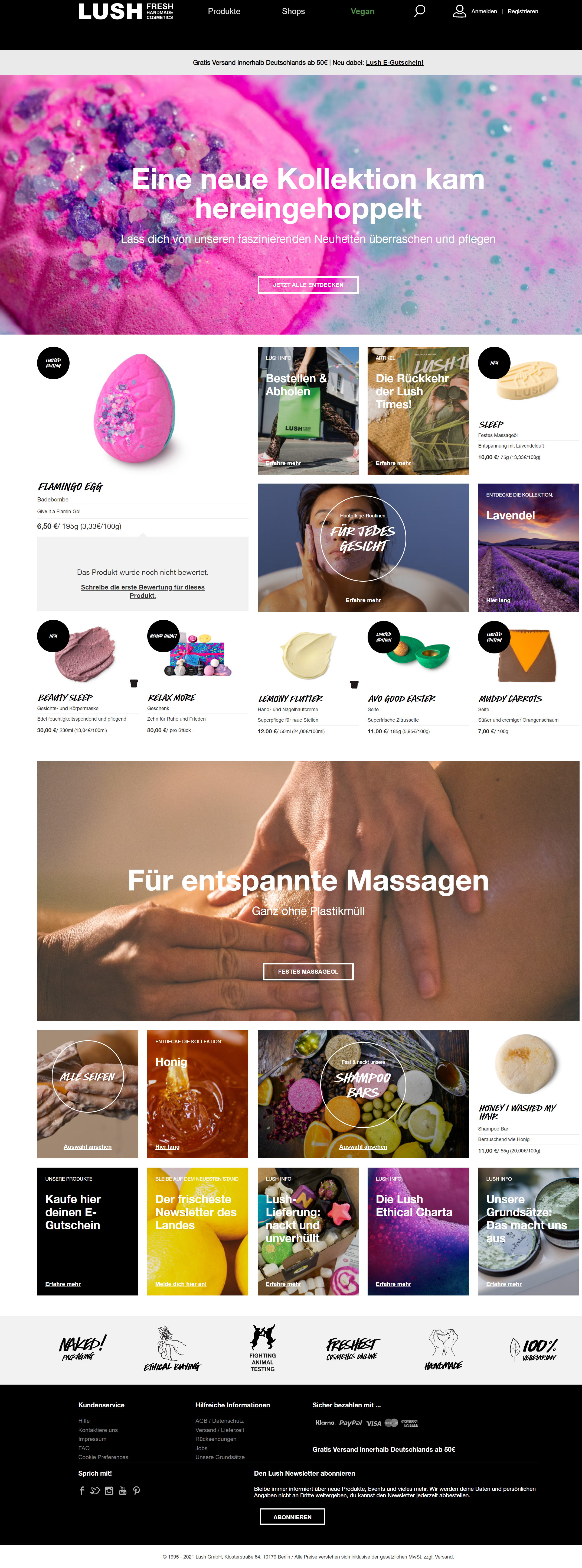
Today I went to check some specific details for a product when I was greeted with the new website design. The very first thing that greets me is the massive, vibrant hero image calling out “fresh, handmade cosmetics”. Below the large font is a call to action button that leads me to new products. But that’s not where I want to go. I continue to look and see a rather odd thing just right above the hero image: tags components being used as a menu with a horizontal sidebar. This is where I lost it. How is this an improvement?
Deleting personal data without consent is not ok
As I can’t really find the product I was looking for without 10 clicks, I’ll just login in into my account to check the order history. Another surprise just happens. I can’t use my old account data but Lush encourages me to register again with the old data. So, this is what I do but with a weird feeling because I’m suspecting that all my wishlist items and all my history is gone. And I’m correct. There’s nothing in my account. Blank.
There I stopped to write this article as I just couldn’t fathom why is this user experience better than their old design.
Old vs. new design
The old website was modern, unique and still used industry standard design layout. The information architecture was well designed behind a menu that was visible. It really helped that the expectations a user might have towards navigating a website were probably met in most cases as the structure was easily recognized.
This type of world knowledge or experience knowledge is a gem that really helps websites be enjoyable. The placement of the login/register options and search bar was on point. It even surpassed the industry standard by playing the search bar on the right as this is more natural to users. Lush’s identity was even represented in the structure. They care about their products, its usage, message and people who produce and use it.
Now we are greeted with a vivid background promoting new products and blogs. Which is fine but not the horrible navigation and missing account history. It makes me angry that such a large company doesn’t care about the user experience. The new website is solely tailored towards power customers that know every product by heart or want to look up their blog. Regular or new customers are left out completely. This isn’t how a user experience should be. It should be inclusive and that means all users, not just a specific group.
Just give your users a menu
One simple solution to solve the problem, at least with the navigation, would be adding a menu to allow users to easily look up products. Currently, you have to know the name of the product and use the very prominent search bar. Obviously you can click through the new menu headings and hope to find what you’re looking for. But the chances are that you won’t. To keep a long story short, just give us a menu that isn’t using tabs or filter components as it’s just confusing.
Just some ending fun fact, the new website, just as the old one have a pretty good accessibility rating (AA or AAA), however, their flow is still horrible and apparently users with accessibility needs find it inaccessible (see the quote above). So this got me wondering if they were just trying to comply with the accessibility guidelines not to face a lawsuit or if the new design was just a mistake? But this is question for another article.
I’ve found the product that I’ve been looking for by using their horrible menu, submenu and finally finding the product only to be greeted with another horrible product detail page design. I’ll leave it on that note.